
Sweet Happy’s

Food for the Soul
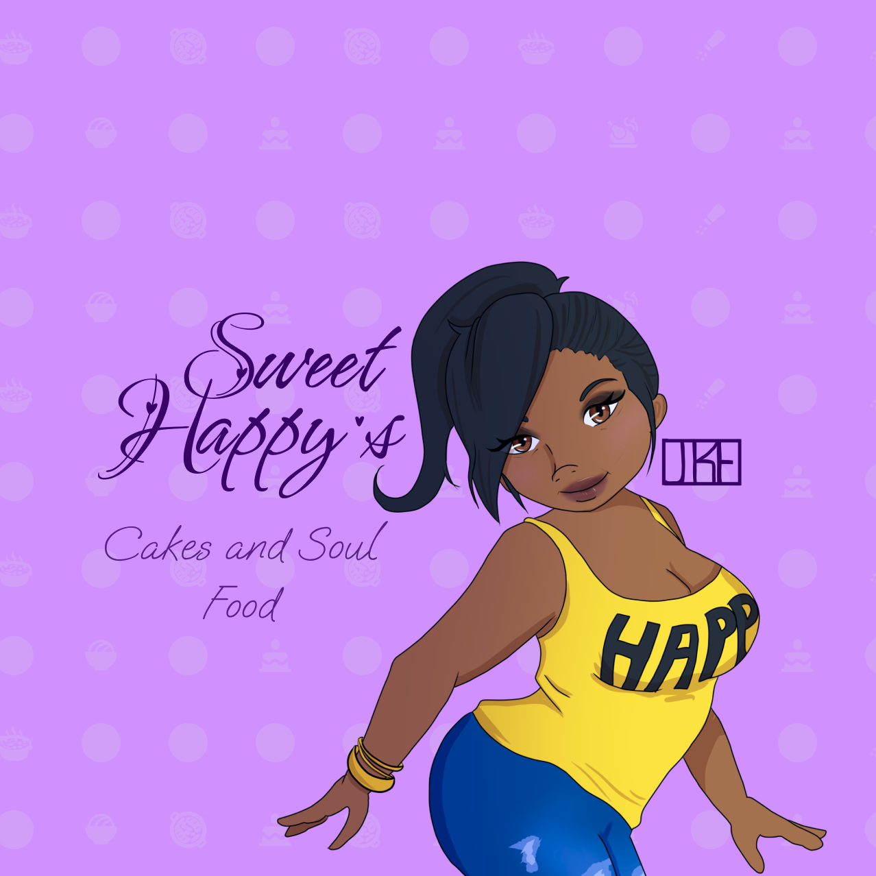
Designing the brand from the ground up with the bakery’s owner was a truly collaborative journey. Together, we shaped the concept, color palette, and overall design to perfectly embody the home baker’s warm, inviting aesthetic. The brand features a playful, dancing color scheme that breathes life and joy into every element, while offering a creative nod to the heart of the home—the kitchen. Central to the design is a charming pin-up style avatar, adding personality and nostalgia, complemented by a carefully hand-arranged font that captures the artisanal, handcrafted nature of the bakery’s offerings. This thoughtful design approach turned an idea into a captivating brand identity that resonates with both the owner and their customers alike.
Iterations to completion
It all begins with an idea for a dream bakery and foodstuffs labels. As we refined our design through multiple iterations, we shifted from a modern, bold aesthetic to something more classic and timeless. We explored different styles, moving from sharp, angular shapes to softer, more balanced forms. The color palette evolved from vibrant, trendy hues to muted, elegant tones. Size adjustments further enhanced the design’s sophistication, creating a look that feels enduring and versatile.
Client
Sweet Happy’s
Tools
Drawings created in CSP.
Labels designed in figma


The Big 2025 Rebrand